Awwwards
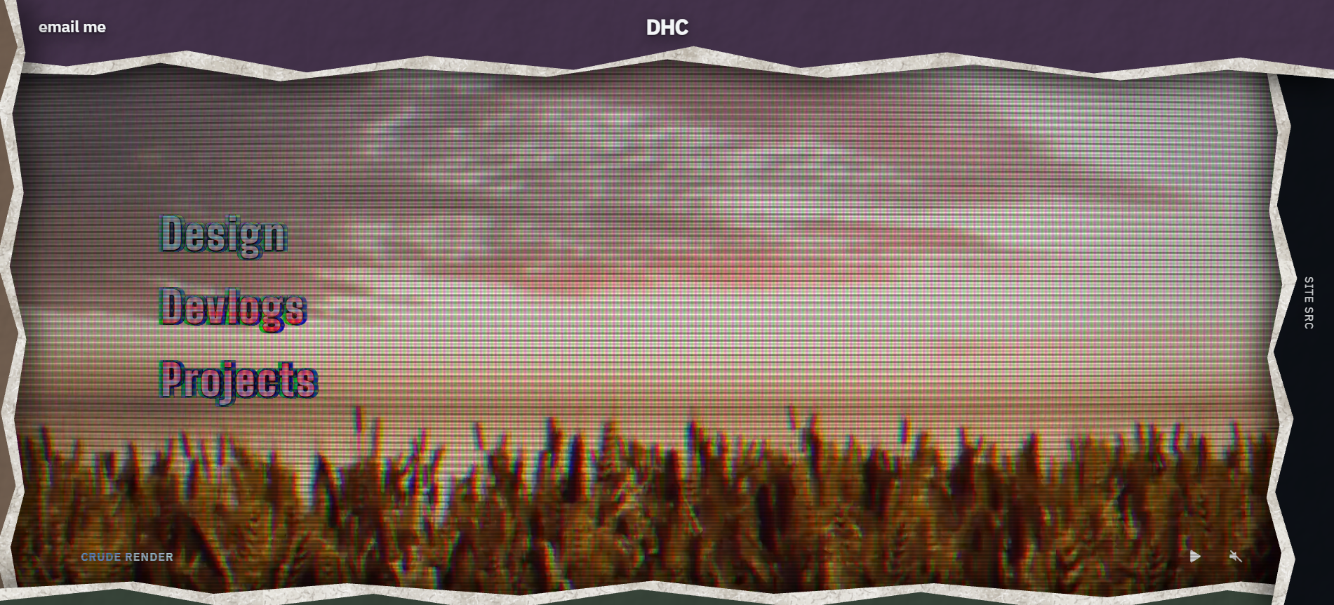
I spend a lot of time looking at Awwwards-recognised portfolios. I wanted to see how close I could get to the work I admire, and find out which parts I could build myself. This became heith.me, the site where I collect my design work, code and games. The landing page opens through overlapping paper panels, with a video reel beneath them. I wanted exploring the site to be part of seeing the work.

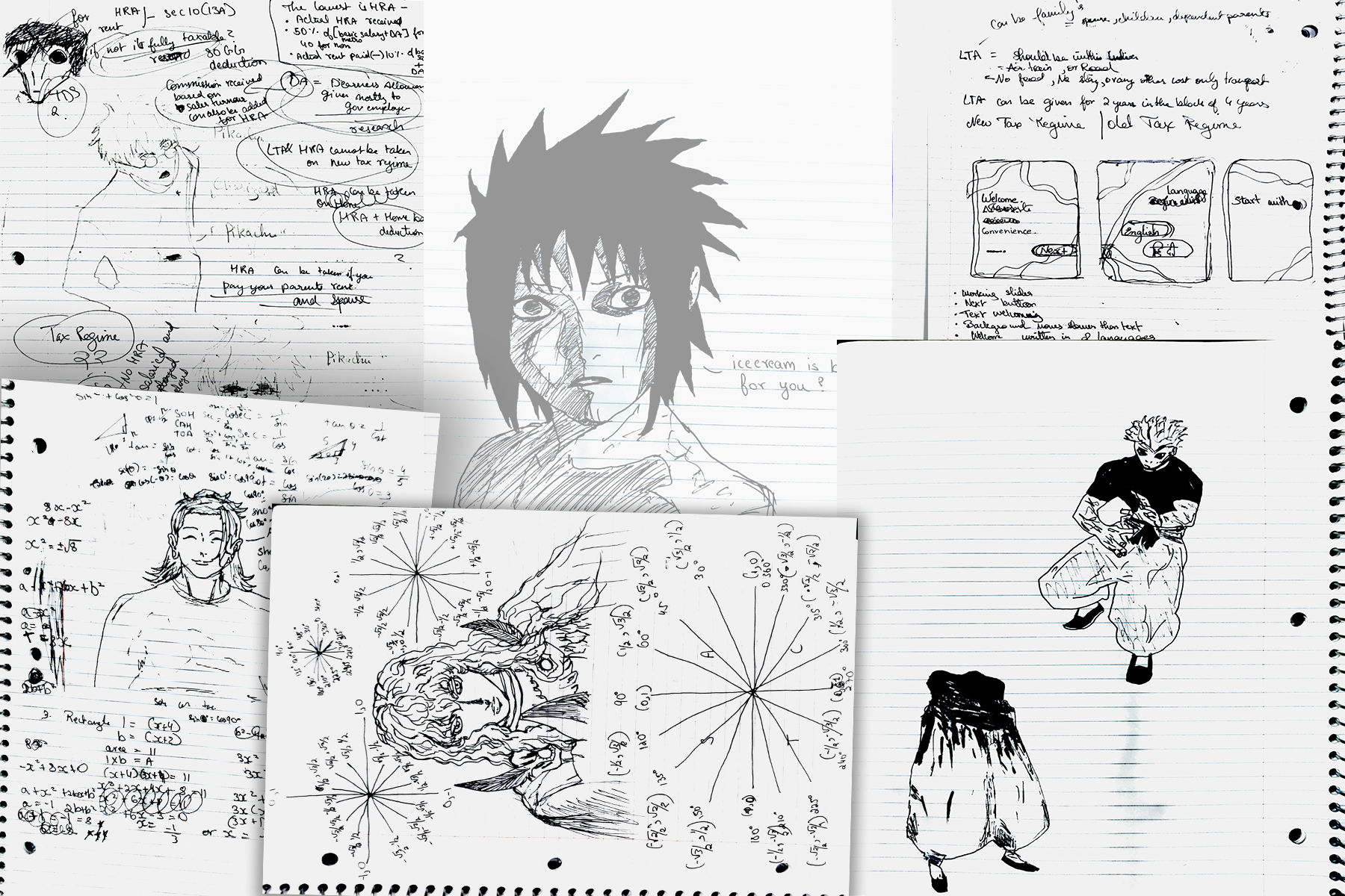
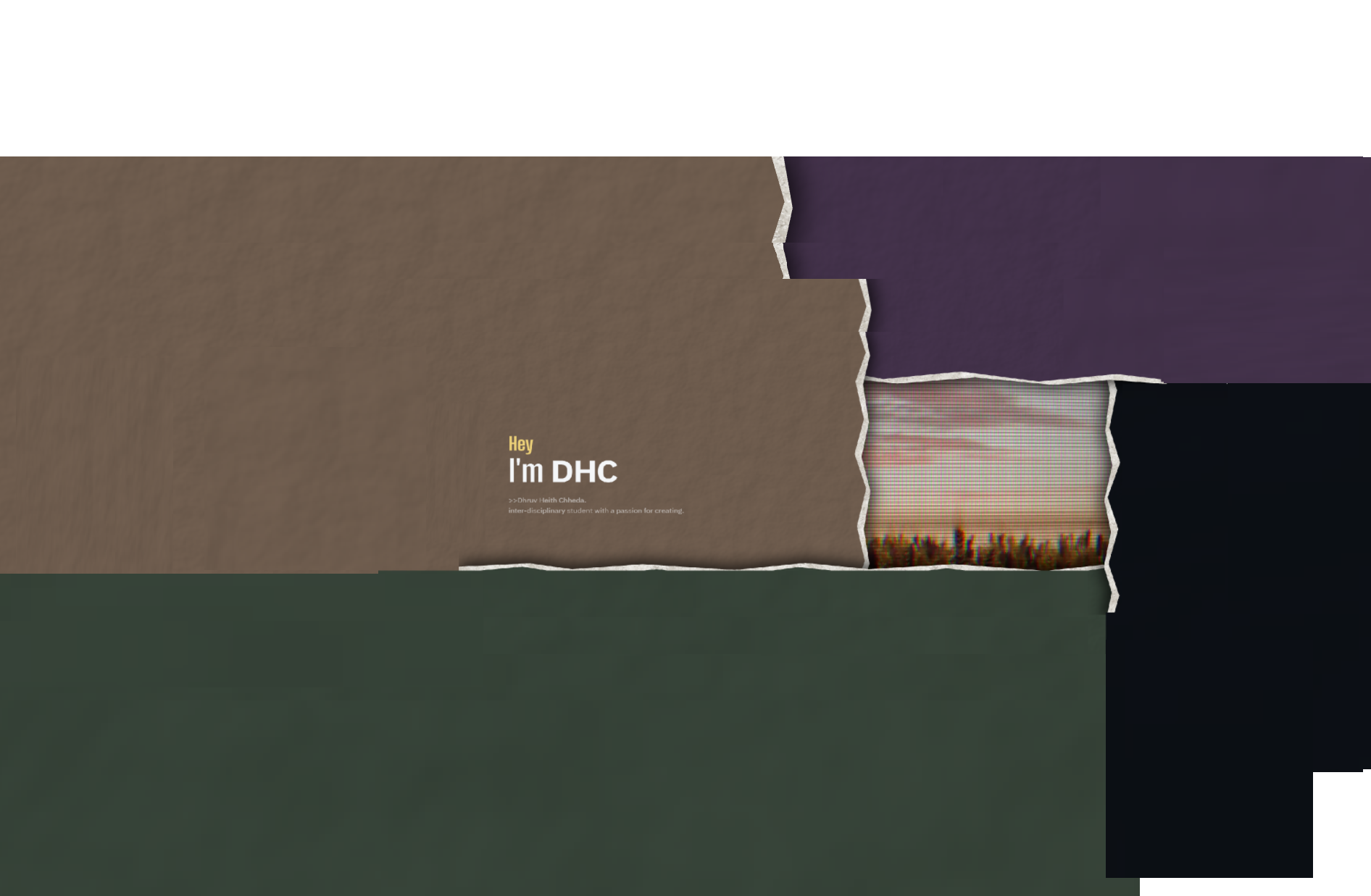
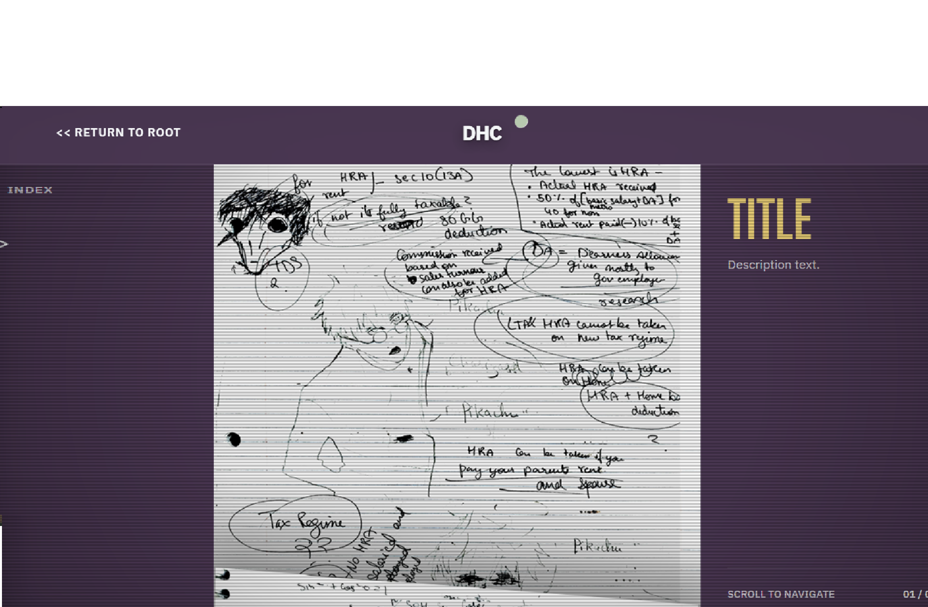
Designing the landing page took much longer than I expected. I kept swinging between versions that felt bleak and versions that were too janky to use. These studies helped me settle on the overlapping paper panels. Their edges gave me a way to divide the screen, place the large links and control how the video would be revealed.
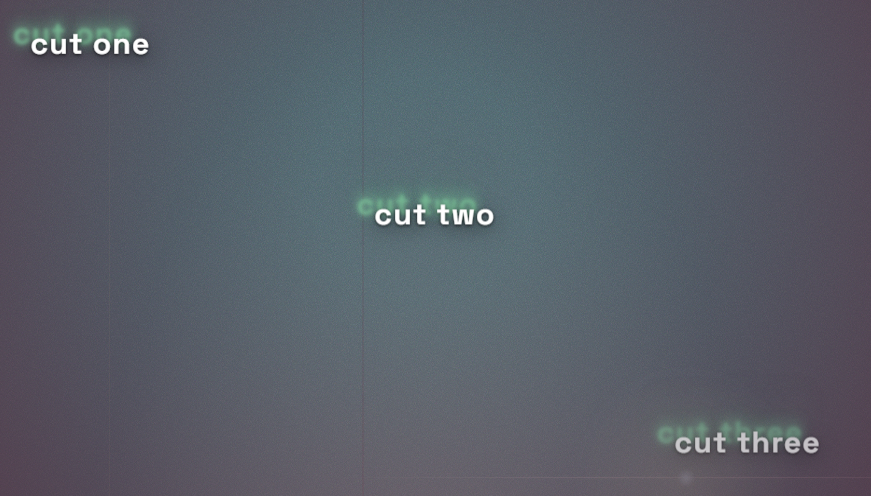
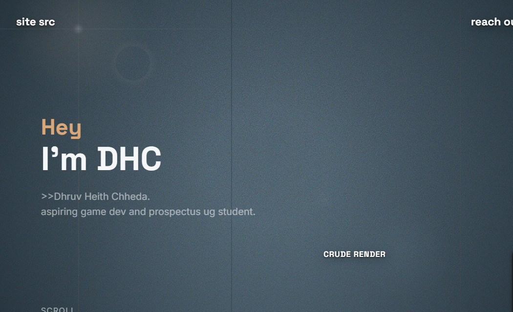
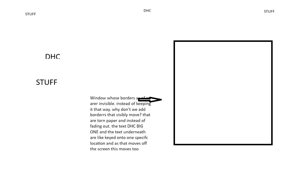
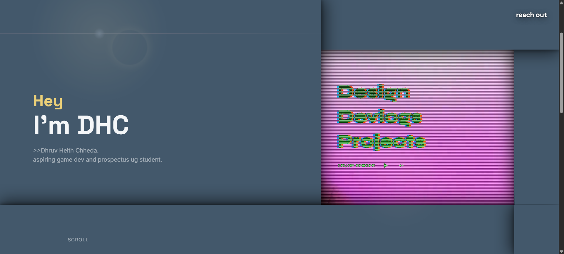
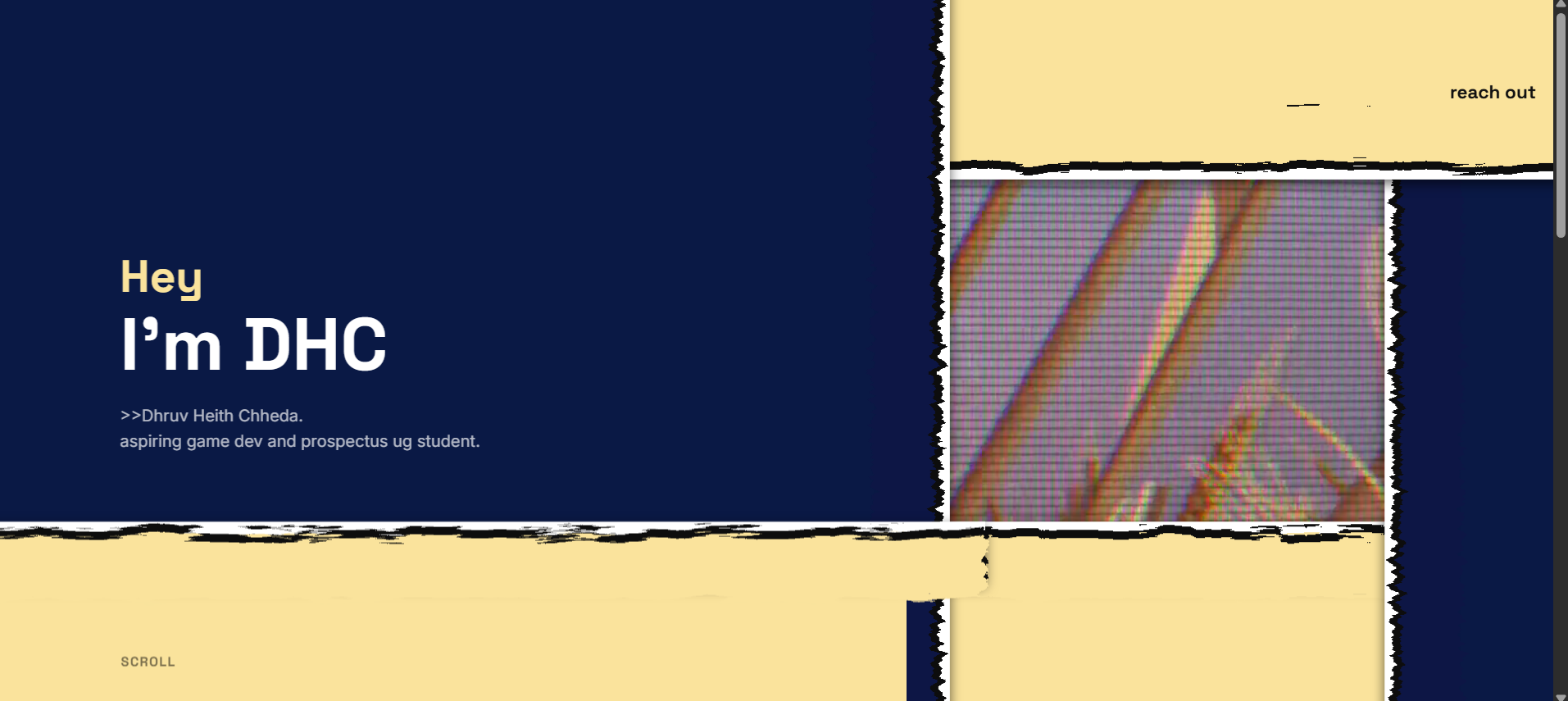
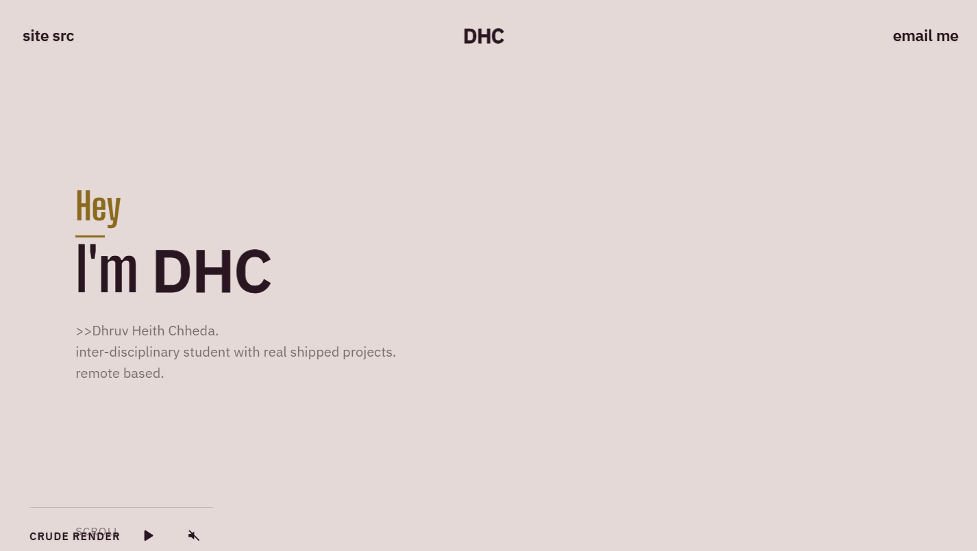
I knew I wanted the landing page to have two very different sides to it. The video reveal was part of the idea from the start. I tried making the paper itself tear open, with the footage sitting underneath.
The final version has paper on top and grainy footage with television scanlines underneath. I wanted the paper to weave over and under itself in an Escher-like loop. Making that overlap work in the browser became its own problem.
Overlap Work
I wanted the top panel to cover the right, the right to cover the bottom, the bottom to cover the left, and the left to cover the top. Each strip would pass over one neighbour and under the other.
CSS controls these panels’ front-to-back positions with a number called z-index. A single stack cannot make that loop: if A sits above B, B above C and C above D, D cannot also sit above A.
I split the right-hand panel into two matching copies. Clipping hides everything outside a chosen part of each copy. The visible upper part sits behind the stack, under the top panel. The visible lower part sits in front of the stack, over the bottom panel. That closes the loop.
Both copies have the same width, torn edge and paper texture. They meet at one cut line, so they read as a single piece. I recalculate that line as the panels move, keeping the join together throughout the opening.
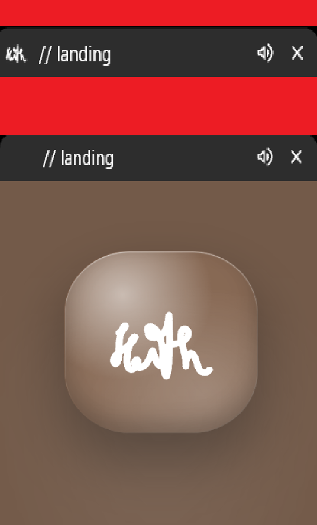
The opening animation is meant to mess with the browser a little. The tab starts with a transparent favicon. A glass version appears inside the loading screen and moves towards the tab. At the end, the real favicon appears. The timing makes the two feel like the same object.
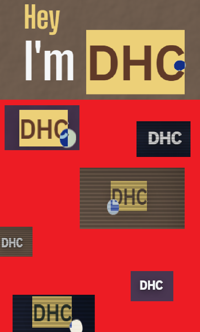
The introduction and the small “scroll” label need to feel printed on the paper. I keep their inner containers at a fixed size and attach them to the moving panel edges. As a panel shrinks, its text moves off screen with it. The torn edge clips anything that should no longer be visible, so the letters keep their shape instead of wrapping into a smaller space.
My initials, DHC, appear in two places: the introduction and the navigation. The left panel covers the navigation’s copy at first. When the paper retracts, the introduction moves away and the other copy is uncovered. The two copies appear to hand the name from the paper to the navigation.
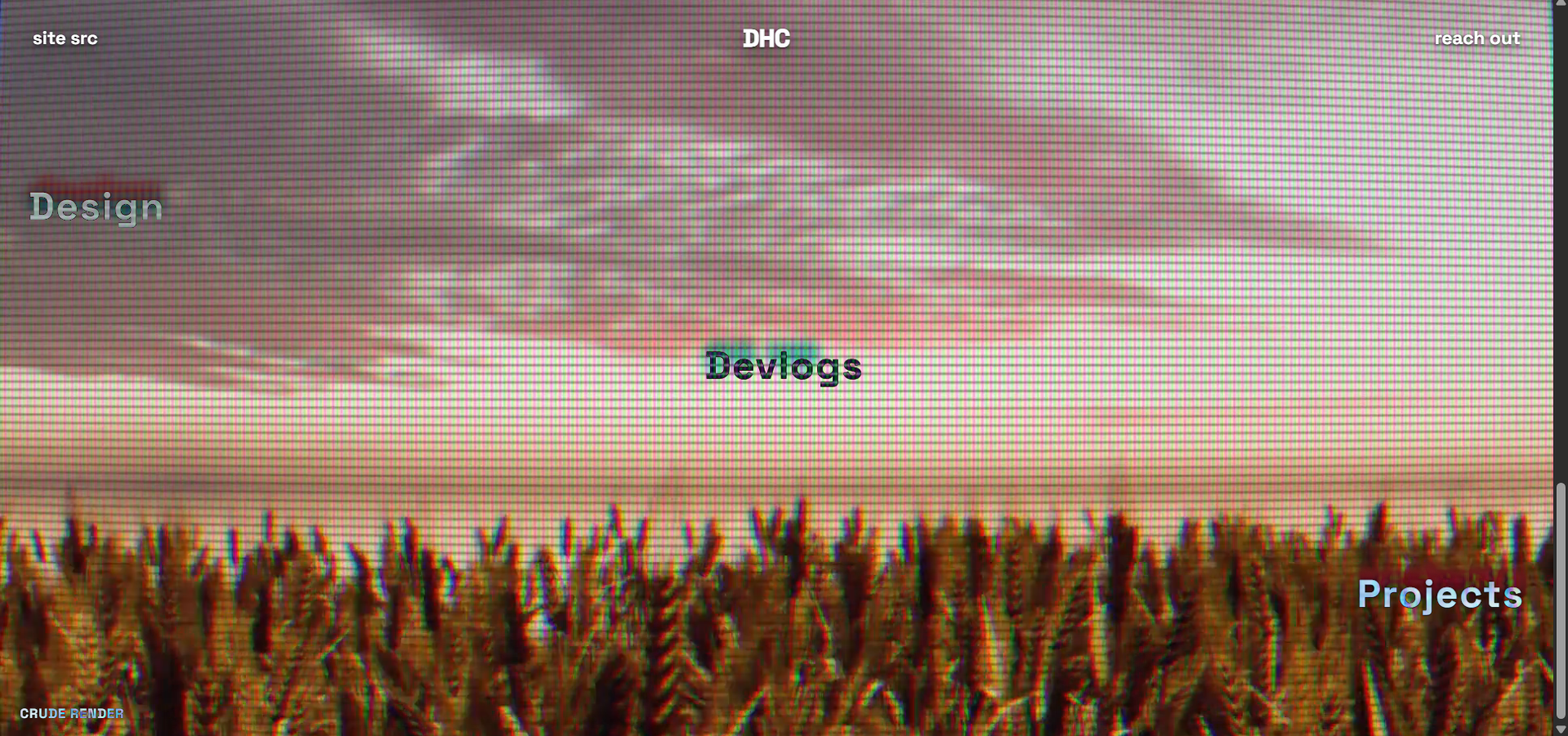
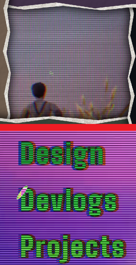
The large links labelled Design, Devlogs and Projects sit over the video. They lead to this portfolio, my development notes and the other projects. Their colours change with the footage through the CSS effect mix-blend-mode: difference.
This effect compares the red, green and blue values of the letters with the footage behind them and displays the difference. White lettering inverts the footage. Similar input colours produce a dark result, which made some frames look muddy.
One colour channel, on a scale from 0 to 255:
I chose a sequence of text colours against particular moments in the footage and timed the changes to video playback. That gave me more control over the result than one fixed colour.
Two coloured outlines sit slightly to either side of each letter. They change colour at the same points in the video, keeping the offset lettering and the footage in step.
The paper panels move back as you scroll and uncover the footage with its television scanlines. Clicking the video window can carry the opening all the way through.
The cursor trails behind the pointer, stretches with its movement and changes over links and controls. I adapted the blob-shaped cursor from Xenobiota, a website by tol-is. I liked how its soft outline looked against the torn paper.
I also reduced repeated work: the paper texture is reused, scroll changes are grouped into animation frames, and the cursor’s movement loop rests when it settles.
Cursor reference: tol-is / Xenobiota
github.com/tol-is/xenobiota
I looked at Wes Anderson’s use of colour: muted tones held close together, with one much louder colour interrupting them.
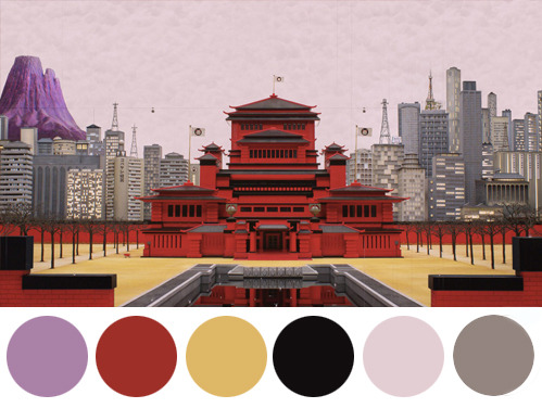
found via Tumblr.
In this reference, the yellows, greys and muddy tones sit together, while the red stands out and the purple feels almost alien. I used earthy brown, mauve and green for the paper panels, then let the video introduce the neon colours.
Each paper panel has its own colour, and those colours carry through to the destination pages. Keeping them muted leaves room for the reel’s bright, shifting colours. The large areas of paper hold the composition together while the footage keeps changing.
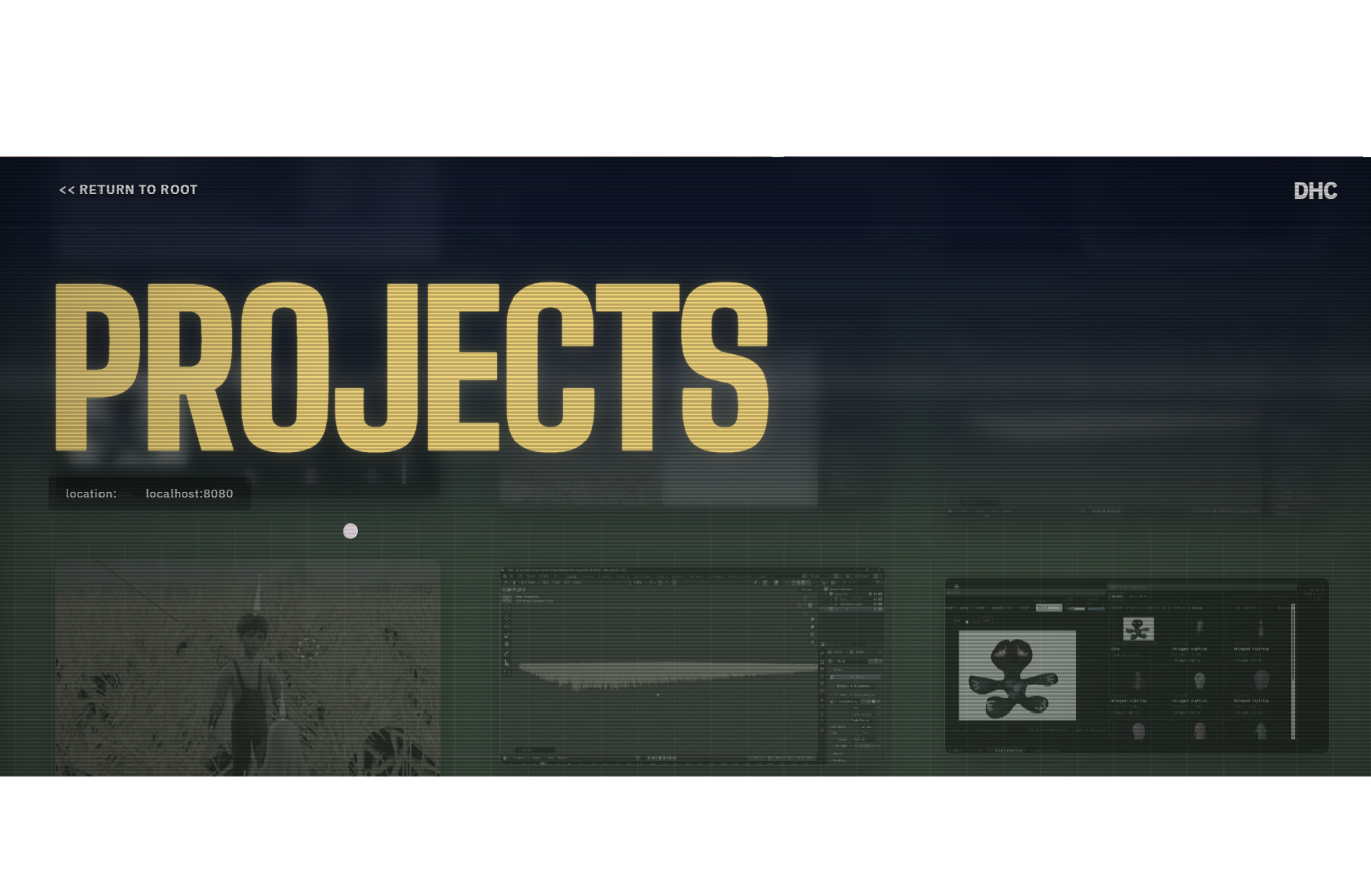
The right-hand panel uses #0D1117, the dark background colour on GitHub. Clicking “site src”, the source-code link, sends the top, left and bottom panels off screen. Their text goes with them, which makes it look as though the whole paper layout is being pushed away.
Before those panels finish leaving, the right panel expands across the screen. It reveals a full-size screenshot of the repository, so GitHub appears to slide in on the paper. Once the picture fills the screen, the browser opens the real repository. The matching background colour disguises that handover.
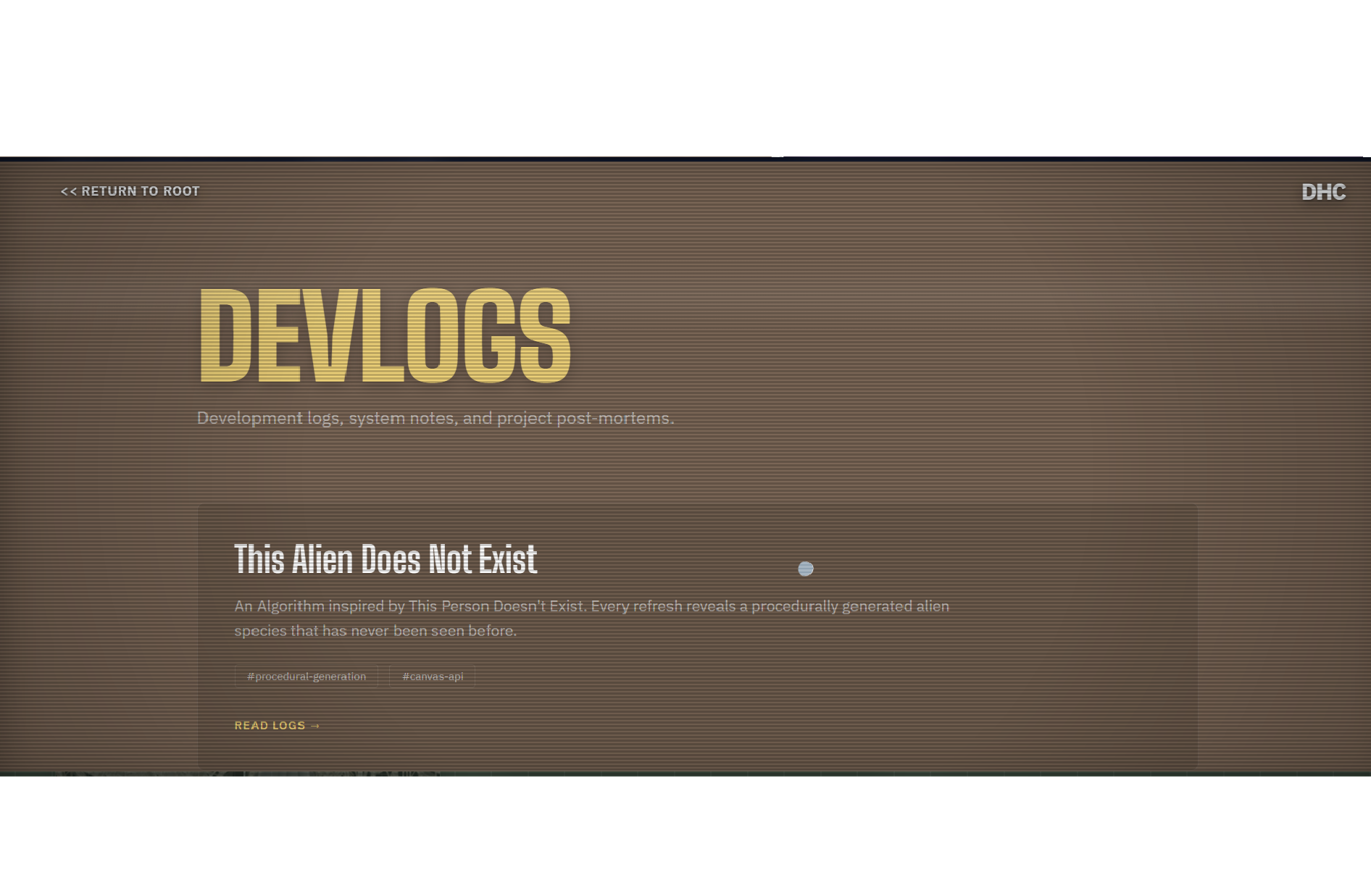
The main site uses Big Shoulders Display for the huge headings and gateway links. I liked how narrow and tall it was, especially at that scale. The labels occupy the paper panels and become part of their shape.
IBM Plex Sans handles the smaller text and controls because it is easy to read at normal UI sizes.
This document uses a quieter set of typefaces. Manrope carries the main text, while JetBrains Mono marks the measurements, labels and technical notes. The fixed page size lets me place images and writing together and keep that arrangement when the portfolio is printed.
The pages begin by alternating between white and black. The two tracks gradually meet at vermilion red, #C1272D. I blended them in OKLCH, a colour system based on lightness, colour strength and hue. The paired dots in the headers show the tracks getting closer while the projects keep their own imagery.
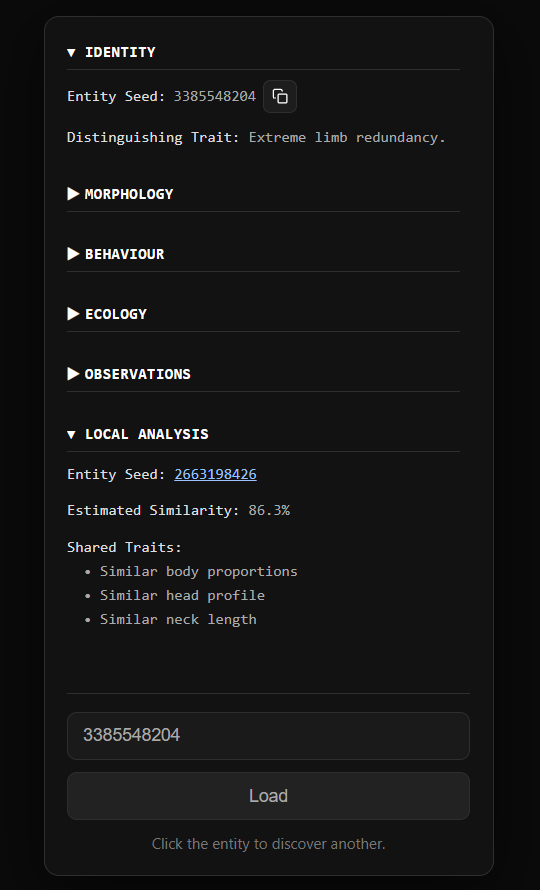
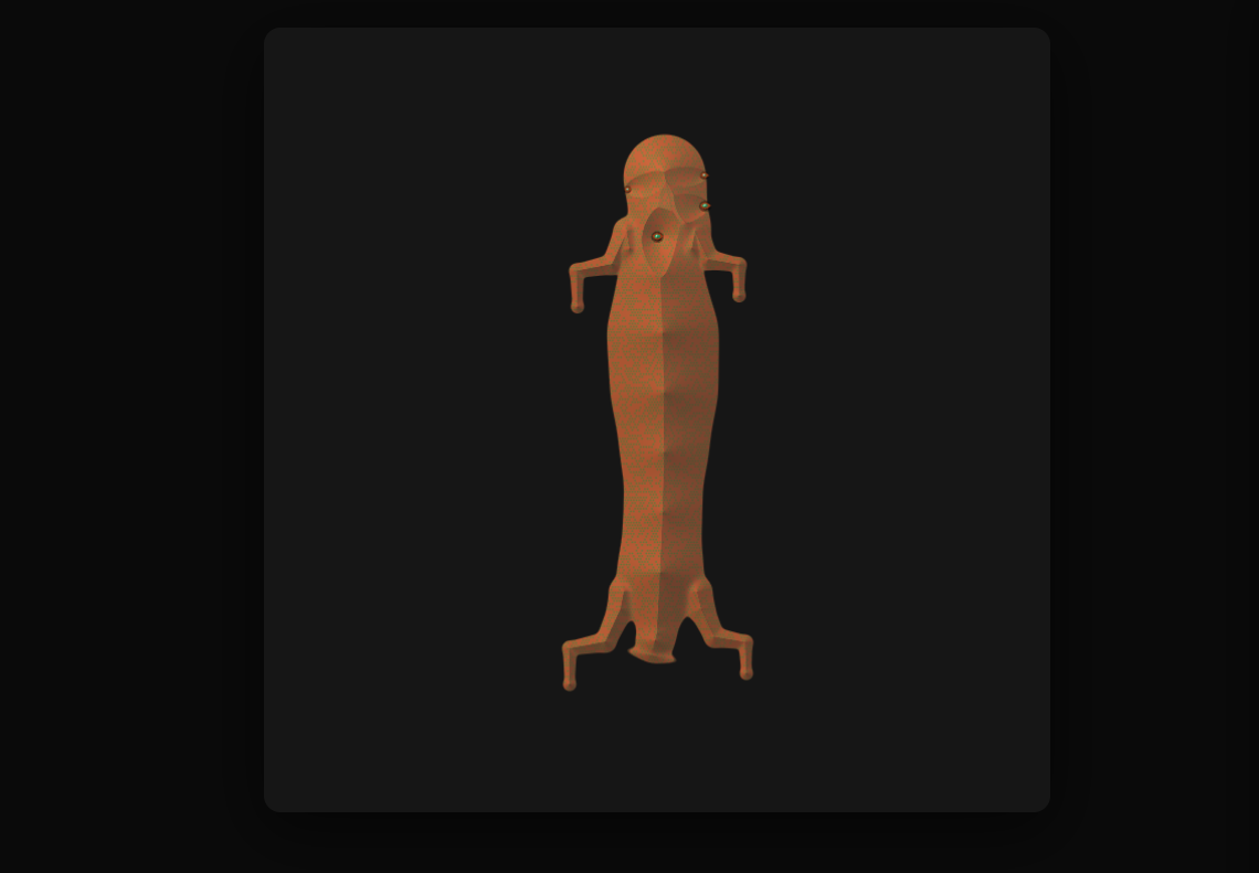
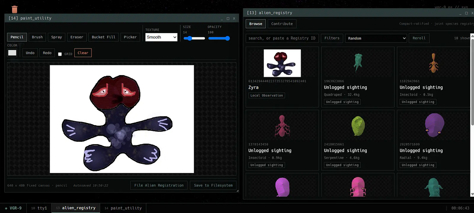
The number you enter into this creature generator is its seed. I use a number generator called Mulberry32 to turn that starting value into a repeatable sequence. The sequence determines the alien, so entering the same seed brings it back. I wanted to see how much variety I could get from rules I could control.
I had to decide which traits could vary on their own and which needed to stay connected. The rules choose the anatomy, colours, textures and other traits, and link those choices to the creature’s classification. That gives the variation some structure: a creature should look as though its parts belong together.
I draw the creature on an HTML canvas, a drawing surface in the browser. Generated limbs and other appendages establish its outline; gradients and textures describe its surface. I can adjust the drawing rules and compare the results using the same seed.
The observations still need work. I want them to say something believable about the creature being shown. Making the anatomy and its description agree is the next problem I want to solve.
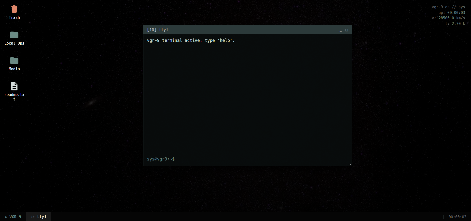
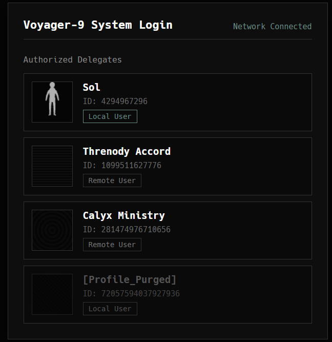
VoyagerOS started as a silly idea: a website that behaves like the computer on a ship that has been travelling for far too long.
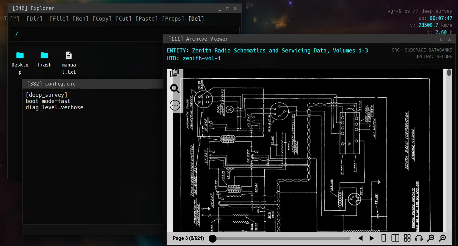
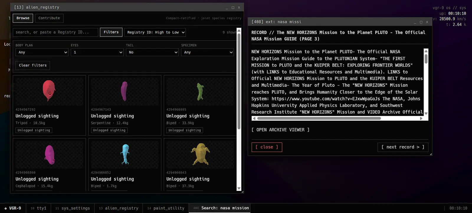
I built the boring stuff too: boot screens, windows, files, a terminal, processes, an archive and a whole fake filesystem. It is basically a tiny computer for a spacecraft that does not exist.
Mission files, logs and strange little bits of data reveal the story of Voyager-9, the fictional mission behind the computer. I put that story inside the things a visitor would normally open or read on a computer. I wanted people to find it by poking around, with each file adding a little more.
The Alien Registry is the computer’s creature archive. It connects this project to my alien generator. Discoveries are stored as .alr files, the archive’s own file type, so each creature becomes a record from the mission.
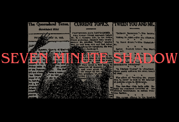
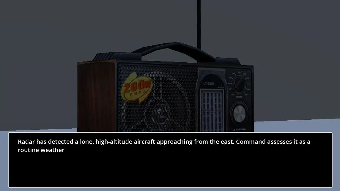
Seven Minute Shadow is a tiny collection of fast, weird little games. Every few seconds the rules change, so the real challenge is figuring out what you are supposed to do before the game decides you have had enough.
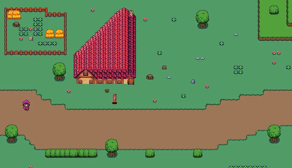
I wanted it to feel deliberately scrappy and playful. Short rounds, quick reactions, pixel art, chunky 3D bits and increasingly questionable ideas. The different art styles are part of that feeling, but each round still needs to make its action readable quickly.
I built the game in the Godot engine and wrote its logic in GDScript, Godot’s programming language. I use Aseprite for the pixel art and animation, and Blender for the 3D pieces. Short rounds let me try an idea on a small scale and see whether it is worth taking further. It is still a demo.